Andrew Clark on Susan Te Kahurangi King
Text independently selected and re-published by The Art Paper, first commissioned by Auckland Print Studio.
Susan Te Kahurangi King developed an interest in drawing during her childhood in the 1950s, which over the subsequent decades has grown into a visually rich, idiosyncratic and evocative artistic practice. During her early years, much of King’s work included a strong focus on the deconstruction, recontextualisation and interpretation of pop culture iconography, ranging from Disney and Warner Bros. cartoon and comic strip characters to motifs drawn from advertising signage and illustrations. Amongst other sources, the fluid, energetic linework and rounded volumes of imported American comics provided King a wealth of motifs; Donald Duck’s blue sailor suit and hat feature in an extended series of 1960s and ‘70s works, while the sleek contours of various Disney characters’ hands, beaks and limbs gradually fold and coalesce into a novel, biomorphic visual discourse that is both culturally resonant and intensely personal.
In her blending of the vernacular with the global, King is part of a wave of New Zealand artists who were influenced by the new consumerism and popular media imported from America in the postwar era, such as Judy Darragh, Paul Hartigan and Bill Hammond. As her practice developed, King began incorporating observational details drawn from her everyday experience into her work, as well as exaggerated but subtly characterised images of people. In the middle-to-late 1970s, King produced intricate, hypnotic dreamscapes that powerfully blend animals, humans and inanimate objects into networked tapestries in which her talents as a cartoonist and draftsperson are evident. During the 1980s, King began to reduce the representational content of her drawings, instead focusing on diagrammatic compositions with a cell- or map-like structure. Following an extended artistic hiatus from the early 1990s through 2008, King further refined her practice, pivoting towards abstract compositions that prioritise rhythm, pattern and structure, often using vibrant, lyrical colour.
In the printmaking process, the end product is the result of a series of steps, often separated by substantial periods of time that afford the printmaker the opportunity to plan and consider their next move in detail. This is both a blessing and a curse, in that it allows the luxury of precision but also imposes a heavy burden of decision-making; at each juncture in the process, there are numerous paths open to the artist, any of which have the potential to improve or damage the final outcome. Master printmakers must be both spontaneously creative and methodically, laboriously diligent, balancing technical craft knowledge (of the chemical properties of acids, the mechanics of press operation and the qualities of different inks and how to apply them) with an intuitive sense of the integrity of the work itself and the ability to visualise the final result and move towards this goal with each decision made.
When a printmaker works with another artist on an edition, this already intricate process is further complicated by the need to also act as a facilitator for another’s artistic practice and vision. In order for the final edition to accurately represent the artist’s practice, it is necessary to divine which elements of the existing work lend themselves best to the print format, and what technical processes will result in prints that will both satisfy the artist themselves and authentically dovetail with their existing oeuvre.
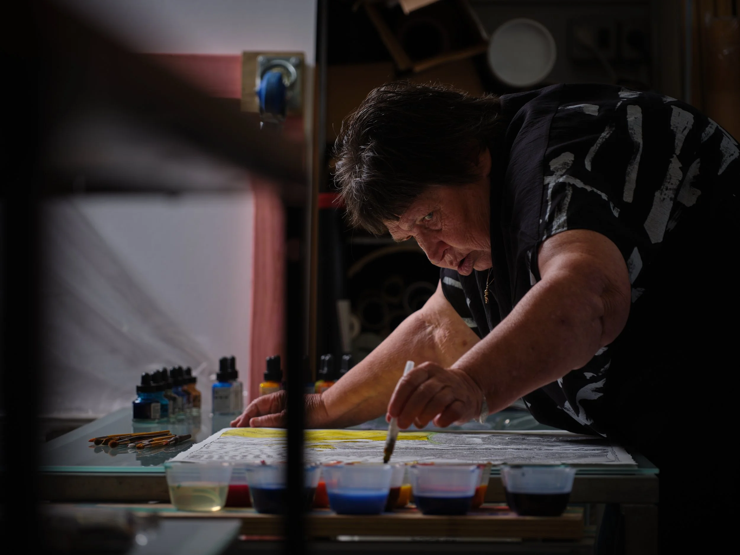
The work of Susan Te Kahurangi King presents unique challenges and opportunities in this regard. While her line-oriented drawing practice is highly compatible with print media such as lithography, her non-speaking status means that any decisions made about the adaptation itself will have to be made without her direct input, and must rather be based on an attempt to anticipate the outcomes most compatible with her practice. When it was agreed that the artist would produce a series of prints, John Pusateri decided that lithography would afford King the fullest range of expression, since it is essentially a drawing-based process to which her existing skills are fully transferable. Because King’s most recent works have largely involved colour in some capacity, Pusateri also decided that it was important for this element of King’s practice to be represented. However, since it is not possible for King to have direct input on the decisions needed in order to prepare separate colour plates, it was decided that a better solution would be for her to have the opportunity to hand-colour some prints from each of her editions. This also allowed King to return to certain of the prints with graphite, adding additional layers of pattern and shading to the printed linework.
King’s engagement with these processes reveals the flexible nature of her practice. Although drawing on the prepared lithography stones with pencil or crayon is similar to the usual media employed in her work, her response was tailored to the specific materiality of lithography. King declines to treat the lithography stone as a neutral vessel for imagery, instead drawing attention to the contours of the limestone slab and building her compositions around minute hairline cracks and imperfections in the stone substrate. This methodology of drawing as a response to a surface can be seen throughout King’s practice, from her earliest works onwards. The artist’s preference for found paper that was already marked, folded or irregularly shaped in some way often allowed the pre-existing marks or imperfections in the material to serve as the starting point for a drawing, much as a microscopic impurity in a chemical solution can serve as the focal point from which a crystal grows. In addition to her acknowledgement of the stone itself in the final print, King’s hand-colouring and pencil interventions mean that the artist’s hand remains visibly present throughout the process, affirming her agency in the outcome. Subtly but forcefully, King’s work subverts printmaking’s tendency to cover its tracks, rendering its process invisible in pursuit of a pristine end-product.
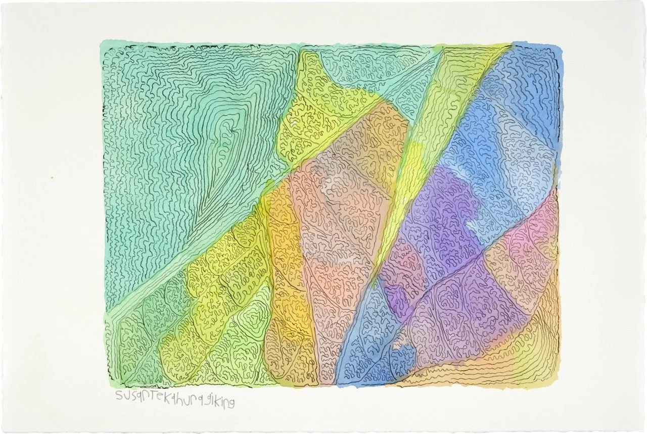
The works in this series consist of traditional limestone lithographs, some with graphite overdrawing and hand coloured elements. The images they depict are dense abstract compositions that seem to deal with the idea of interiority or enclosure, deploying compositional motifs such as spirals and chains of interlinked, cell-like volumes. As clarified by the artist’s sister Petita Cole, King’s drawing process is accumulative and procedural, the composition arising emergently as the drawing organically grows from one or more points on the picture plane.(1) King follows this methodology down to an intensely granular level, each successive set of marks building on and pushing against the ones that came before. This process results in formations like the concentric growth rings of a tree or the folds and crenellations of a brain; works that echo themselves, nesting gesture within gesture, each layer of mark-making responding to and recontextualising the one before it.
King’s practice has always incorporated an interest in the hidden, the obscure and the inconspicuous. This “secretive quality”(2) finds expression in this latest series, especially in the works that utilise pencil shading. Here, areas of the print are filled and darkened in such a way that the original linework becomes a trace or palimpsest, a ghostly pattern submerged beneath the surface of the image like a skeleton within a body. This sense of secrecy or privacy seems linked to the theme of interiority; In King’s early works, the “public” forms of cartoon characters (being commercial, multiple and sterile) were deconstructed and recontextualised to form private, domestic narratives that are visceral, bodily and specific. In one work, the clown mascot used to advertise Fanta soft drinks is depicted seated in an armchair and knitting,(3) while elsewhere ducks and other “funny animals” are seen interacting with humans and are thus brought into the real world, made mortal, fallible and relatable and, ultimately, broken up into their constituent parts. In her abstract works, King develops similar private spaces, although they are less narratives than jewel boxes or carefully tended gardens, closed ecosystems reminiscent of the cabinets of curiosities and shadowboxes of Joseph Cornell. Like Cornell, King creates spaces where personal reflection and reverie can take hold: interlocking coloured volumes break the picture plane into a stained-glass-like lattice, while beneath and between them, meandering lines and shimmering fields of pattern flow like schools of fish. The works are puzzle boxes, containing both a delicate sense of balance and an exuberant, fertile energy.
However, it is important to remember that enclosure and inwardness each contain within them their opposite. Gaston Bachelard cautions against binary modes of thought concerning inside and outside, exclaiming: “What a spiral man’s being represents! ... One no longer knows right away whether one is running towards the center or escaping.”(4) For Bachelard, the very act of imagining an inner self, delineated from the outside world, creates a metaphor that in turn rearranges that self, and so on ad infinitum: humanity is “an unsettled being which all expression unsettles.”(5) King’s chambers, spirals and cells can be read as the internal workings of a mind, or the closed circuits of a shell or fortress, but this is needlessly reductive; according to Bachelard, the inner and the outer are mixed, uncertain, subject to change and inversion. King’s borders and boundaries might just as easily be lines of flight or vectors of escape, taking shape in the space between the hand of the artist and the mind of the viewer.
Footnotes
(1) Chris Byrne and Petita Cole, “Interview,” in Tina Kukielski, The Drawings of Susan Te Kahurangi King (Institute of Contemporary Art, Miami: 2016), 97.
(2) Ibid., 98.
(3) Tina Kukielski, The Drawings of Susan Te Kahurangi King, 28.
(4) Gaston Bachelard, The Poetics of Space (New York: Penguin Books, 2014), 229.
(5) Ibid., 230.
Susan Te Kahurangi King's Auckland Art Fair booth with Auckland Print Studio, February 2021. Courtesy of Auckland Print Studio
Susan Te Kahurangi King's Auckland Art Fair booth with Auckland Print Studio, February 2021. Courtesy of Auckland Print Studio
Print ephemera at Susan Te Kahurangi King's Auckland Art Fair booth with Auckland Print Studio, February 2021. Courtesy of Auckland Print Studio
Susan Te Kahurangi King in her Auckland Art Fair booth with Auckland Print Studio, February 2021. Image courtesy of Auckland Print Studio
Susan Te Kahurangi King hand-colouring a lithograph, Auckland Print Studio, January 2020. Courtesy of Auckland Print Studio. Photo: Sam Hartnett
Susan Te Kahurangi King preparing a lithograph, Auckland Print Studio, January 2020. Photograph by Sam Hartnett. Courtesy of Auckland Print Studio
Susan Te Kahurangi King hand-colouring a lithograph, Auckland Print Studio, January 2020. Courtesy of Auckland Print Studio. Photo: Sam Hartnett
Hand-coloured lithograph ready for printing by Susan Te Kahurangi King, Auckland Print Studio, January 2020. Courtesy of Auckland Print Studio. Photo: Sam Hartnett
John Pusateri and Susan Te Kahurangi King working through the lithograph process, Auckland Print Studio, January 2020. Courtesy of Auckland Print Studio. Photo: Sam Hartnett
John Pusateri preparing a lithograph by Susan Te Kahurangi King, Auckland Print Studio, January 2020. Courtesy of Auckland Print Studio. Photo: Sam Hartnett
A separate article by Priscilla Rose Howe on Susan Te Kahurangi King features in ART Paper Issue 00, buy it here.


